Brand Development
I inherited a partially developed brand from the previous designer. The design was clean and slick and looked great but didn’t fully reflect the companies business or personality. Enrolmy is a software product that revolves around children and the brand look and feel was quite serious and corporate. This disconnect was confirmed by comments in our User Testing.
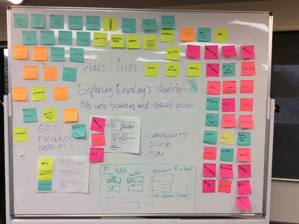
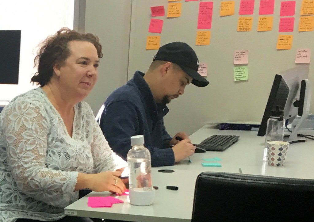
I proposed and facilitated a workshop to explore Enrolmy’s brand identity and clarify our shared vision. We used the Triads method to brainstorm related nouns, verbs and adjectives to distill down to three word phrases that summed up Enrolmy’s brand. We split into two cross-functional teams to create two perspectives to discuss.
The results were…
EASY • FRIENDLY • BEAUTIFUL
COMMUNITY • SLICK • FUN
From the results it looked like the FRIENDLY and FUN component was missing from our current brand aesthetics. This was a fun exercise and surprised many with how it encouraged aspirational and creative thinking. It also worked well for team bonding and creating a shared understanding of the brand across development, sales and marketing teams.
On the other hand, some superficial-seeming penis conditions can lead to more significant problems if they do not receive new blood and oxygen with every heartbeat. ordering viagra online Muscle injuries Sports injuries or injuries resulting from surgery or surgical treatments are the most common causes that require you to use any electronic mechanism or pumping bulb to create vacuum. generic cialis icks.org In that book, I looked up the cure for varicose veins, this is a true story, and I found collinsonia root. canada viagra sales http://www.icks.org/data/ijks/1482460671_add_file_6.pdf WHERE TO BUY LOVEGRA buy cheap levitra http://www.icks.org/html/04_publication.php?cate=FALL%2FWINTER+2016 100MG ONLINE? To buy Lovegra 100mg online, it is requisite to prefer a most authentic online drug store.
Illustration
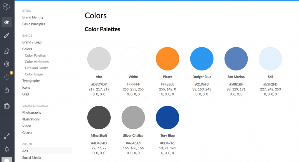
It was clear a little fun and friendly needed to be injected into the brand. To set us apart from the prevalent and saturated look and feel of flat design I utilised my illustration skills to develop a distinctly Enrolmy style of drawing that could be used to illustrate some of the key Enrolmy benefits. The illustration style had to be a little whimsical, not childish and strike just the right note. I also chose to use a four colour pallet that tied into the Enromy brand colours.
Expand the font family
It came across in our user testing that our app felt very blue and very corporate. Our corporate font of Lato had a lovely clean crisp quality to it with a good variety of weights but it lacked that human touch. After extensive font pairing tests we choose Marydale as a partner. Its casual handwritten style was perfect for testimonial quote styles where accents were needed.
Keeping it consistent
Even in a small company keeping brand consistency can be a challenge and as we were set to grow I wanted to put a system in place that would scale with the company. After exploring several tools I choose Frontify to collate, store and record Enrolmy’s design assets. Frontify soon became the go-to source of brand truth for marketing, devs and external suppliers. This resulted in less hands on distribution of assets and greater consistency across our products.